


 159 / 196

T W E N T Y T H I R D E D I T I O N
T H E B U I L D I N G C O N S E R VAT I O N D I R E C T O R Y 2 0 1 6
1 5 9
INTER IORS
5
COLOUR IN GEORGIAN
INTERIORS
EDWARD BULMER
T
HE START
of George I’s reign saw the
publication of two works which were to
have a powerful impact on architecture
and design in the Georgian period (1714–1830):
the first English edition of Palladio and the
initial volumes of
Vitruvius Britannicus
. Both
are now seen as manifestos for the adoption of
a classical approach to the design of buildings.
Important patrons began to adopt the ‘new’
classical style although, in truth, classical
architecture was not new to England – the
innovation lay in the rigour with which
classical design was now applied throughout
the building, and not solely to their exteriors.
This heralded the age of the ‘correct’ use
of the classical orders, in which line came
before ornament. Classical proportion could
now be adopted without the need for costly
decoration, so the highest status buildings
were sometimes the most august and the
simplest. It could be summed up as ‘grammar
not vocabulary’ – design for the mind as well
as the eye.
Fashion, while not being the only driver
(many existing buildings remained resolutely
un-remodelled) worked as it does today. What
the rich wanted they got and what the less
well-off saw the rich having, they imitated as
cheaply as possible.
Palladianism, as architectural historians
have now termed this classical revolution,
was a universal style. It had the great good
fortune of looking good in ‘common colours’
(see page 160) as well as the richest of
finishes. It was a style that had its roots in
stone building and, for walls, pilasters and
columns, the stony tones of earth pigments
included in the palette of ‘common colours’
were therefore very suitable. (Other common
colours included browns and greys which
tended to be used for distinct elements –
brown for timber elements such as window
joinery, but usually stone colours for skirtings,
whether or not made of timber.) Thus we
find that natural stone and stony colours
predominate even in high status interiors.
Although it should be noted that the
pigments used for this ‘cream through to
beige’ palette did differ in price (see Baty,
Further Information), the greatest difference
was made by the introduction of gilded
enrichments, carved furniture and deeply
dyed cloth for wall hangings and upholstery.
Much of this decoration was achieved with
imported materials and émigré craftsmen.
Contemporary conversation pieces and
portraits help us to visualise the effect of
these interiors.
Classicism embodied hierarchy, best
recognised in the orders, from Doric to
Composite. Ancient and, later, renaissance
writers sought to explain their meaning and
how to use them. By the early 18th century
architects and builders sought to employ
the orders as a narrative of their client’s and
their own learning, culture and status. They
were used to ornament interiors but also to
differentiate their function.
The entrance hall of a wealthy household
was a room to receive all comers, from
messengers to dignitaries and as such
was couched in terms of the exterior of
the building – finished in a sculptural
and emblematic idiom and furnished for
durability. A typical hall would not have
‘stuffs’ (no curtains or upholstery) as they
could harbour germs. Instead a polished
hall chair would proclaim the lineage of the
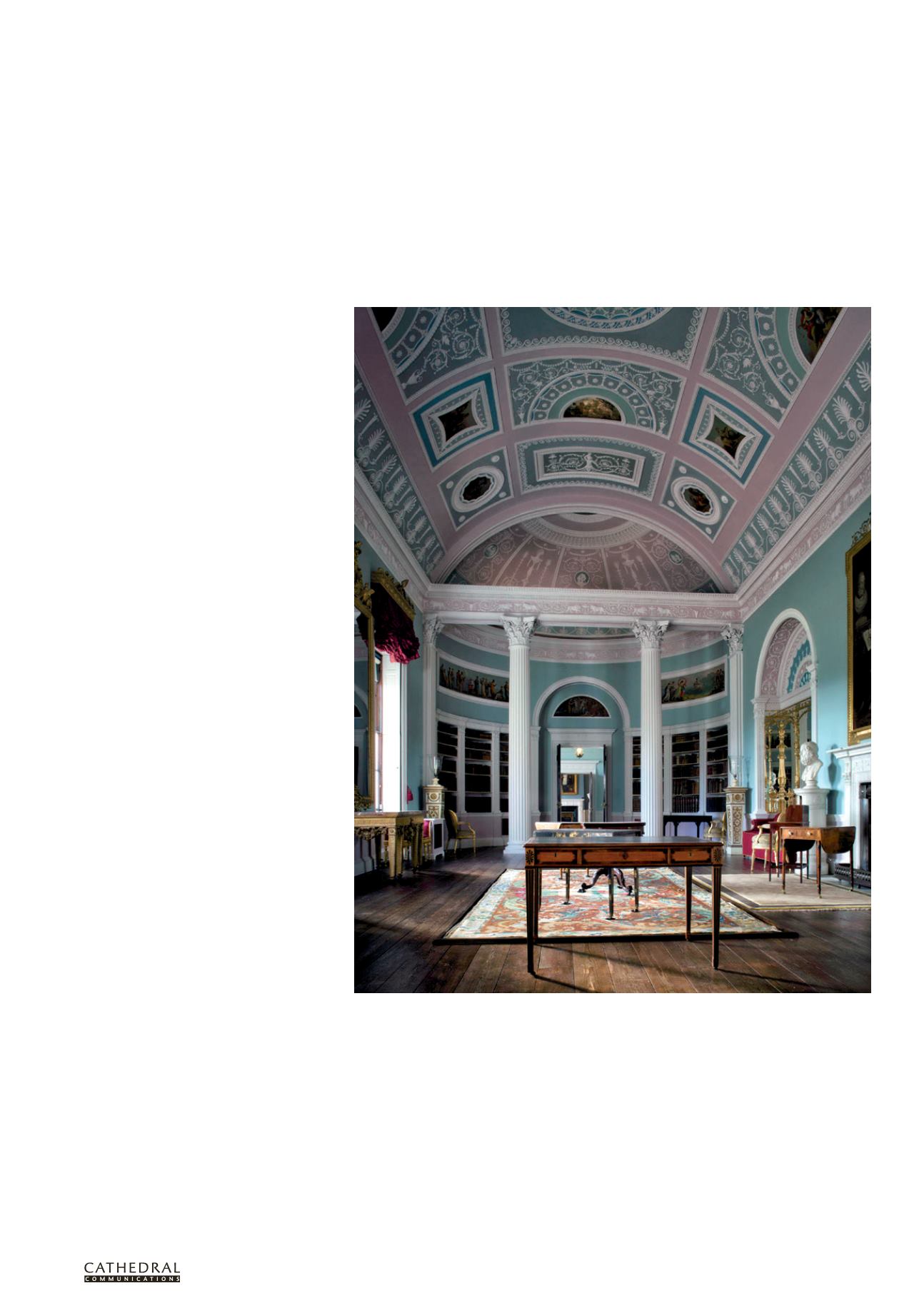
The Library at Kenwood after recent redecoration showing the colours used in the first decorative scheme.
The window cornices, one window seat and the pier glasses are the sole survivors of the original furnishing
that accompanied this scheme.