


Colour in Georgian Interiors
Edward Bulmer
 |
|
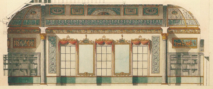
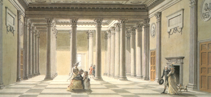
| Robert Adam’s 1767 proposal for decorating the library at Kenwood House. Recent paint analysis has shown that Adam’s proposal for gilding was not carried out until the second scheme and in the first scheme the allocation of colour was changed. |
The start of George I’s reign saw the publication of two works which were to have a powerful impact on architecture and design in the Georgian period (1714-1830): the first English edition of Palladio and the initial volumes of Vitruvius Britannicus. Both are now seen as manifestos for the adoption of a classical approach to the design of buildings.
Important patrons began to adopt the ‘new’ classical style although, in truth, classical architecture was not new to England – the innovation lay in the rigour with which classical design was now applied throughout the building, and not solely to their exteriors. This heralded the age of the ‘correct’ use of the classical orders, in which line came before ornament. Classical proportion could now be adopted without the need for costly decoration, so the highest status buildings were sometimes the most august and the simplest. It could be summed up as ‘grammar not vocabulary’ – design for the mind as well as the eye.
Fashion, while not being the only driver (many existing buildings remained resolutely un-remodelled) worked as it does today. What the rich wanted they got and what the less well-off saw the rich having, they imitated as cheaply as possible.
Palladianism, as architectural historians have now termed this classical revolution, was a universal style. It had the great good fortune of looking good in ‘common colours’ as well as the richest of finishes. It was a style that had its roots in stone building and, for walls, pilasters and columns, the stony tones of earth pigments included in the palette of ‘common colours’ were therefore very suitable. (Other common colours included browns and greys which tended to be used for distinct elements – brown for timber elements such as window joinery, but usually stone colours for skirtings, whether or not made of timber.) Thus we find that natural stone and stony colours predominate even in high status interiors.
Although it should be noted that the pigments used for this ‘cream through to beige’ palette did differ in price (see Baty, Further Information), the greatest difference was made by the introduction of gilded enrichments, carved furniture and deeply dyed cloth for wall hangings and upholstery. Much of this decoration was achieved with imported materials and émigré craftsmen. Contemporary conversation pieces and portraits help us to visualise the effect of these interiors.
 |
 |
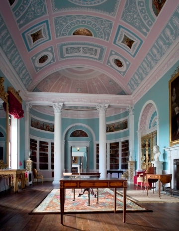
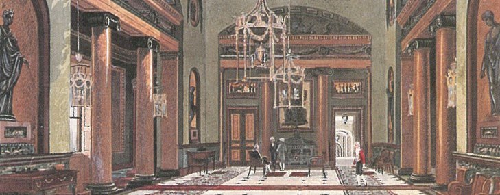
| Above left: The Library at Kenwood after recent redecoration showing the colours used in the first decorative scheme. The window cornices, one window seat and the pier glasses are the sole survivors of the original furnishing that accompanied this scheme. Above right: Georgian panelling decorated in linseed oil paint in Eau de Nile. | |
Classicism embodied hierarchy, best recognised in the orders, from Doric to Composite. Ancient and, later, renaissance writers sought to explain their meaning and how to use them. By the early 18th century architects and builders sought to employ the orders as a narrative of their client’s and their own learning, culture and status. They were used to ornament interiors but also to differentiate their function.
The entrance hall of a wealthy household was a room to receive all comers, from messengers to dignitaries and as such was couched in terms of the exterior of the building – finished in a sculptural and emblematic idiom and furnished for durability. A typical hall would not have ‘stuffs’ (no curtains or upholstery) as they could harbour germs. Instead a polished hall chair would proclaim the lineage of the owner in its decorative arms and the other ornamentation was frequently in the form of relief and statuary. Paintings, when employed, were often set into the walls as part of the room’s architecture.
Much the most common decorative scheme for this room would have been a stone white colour mixed with earth pigments and perhaps carbon black. In terms of democratising interior decoration this proved to be the most influential room in the house. Its colour scheme proclaimed gentility and learning but its execution employed the cheapest pigments. This could be emulated right down the social scale.
As a default this approach endured throughout the Georgian period. In many ways it endures to this day – the communal spaces of high status buildings are still often in a tinted white and the popular predilection in selecting a colour is still to choose a variant of white tinted with the equivalent of earth pigments.
Early in the century fitting out of an interior was generally done with full timber panelling or just wainscot (a panelled dado in effect). It was usual to use softwood if it was to be painted and rooms that were to be hung with paper or fabric would be battened out above the wainscot and lined with canvas. This meant that colour was mainly rendered in oil paint allowing for deeper colouring as, unlike the opaque white medium of a limewash or distemper, linseed oil was clear, meaning that the pigment went further. Nevertheless it could take up to five coats to achieve a solid colour and so lighter colours remained the choice for economy.
 |
|
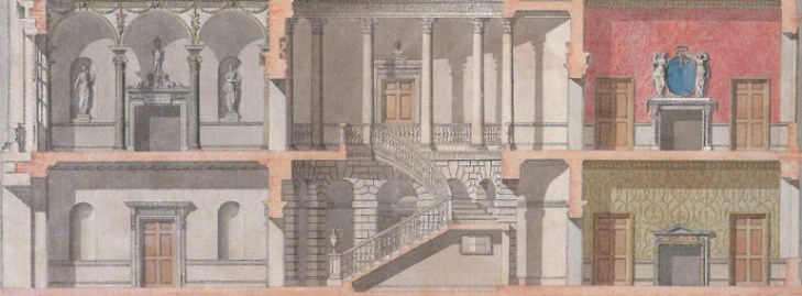
| Detail of an unexecuted design for York House, London by Sir William Chambers (1759): this and similar examples of coloured cross sections clearly show the hierarchy of colour used in the Georgian period. Stone or common colours are used in the communal spaces like the hall and stair and richer colours, some with pattern, adorn the family rooms. |
Early in the Georgian period, strong colour was usually introduced in dyed cloth – damasks, wools and velvets. When these fabrics were used for walling their cost indicated a room of importance. This could be a private or a public room but was seen and used by a very select audience. All the time the eye was to be delighted but the mind was intended to understand the status and cultured standing of the patron. The dyes employed in Paris or Genoa underlined this, blues, greens, reds and yellows all signalled rarity and richness. Following their use by the wealthy, the producers of cheaper alternatives adopted these colours for everything from flock paper to wall paint. Luxury defined the palette and was a function of cost. Colours became emblematic as was the case in easel painting.
As the 18th century progressed, timber wainscot gave way to plasterwork. While it had been customary to paint panelling in a uniform colour from skirting to cornice, the arrival of applied wooden mouldings on flat plastered walls allowed distempers to be used on the flats. Using distemper to decorate could allow for further cost savings – minimal pigment was required to produce an off-white oil paint for the trim, and effective use of pigment with binders meant greater coverage and therefore fewer coats, for the walls. Picking-out required more time but was a good way to emphasise the skill of the ‘stuccadore’ and gradually plaster ornamentation became the dominant vehicle for styling a room. It spelled the end of the dominance of classicism as the complicated designs of rococo France or gothic England became achievable without the need for wood carvers or marble masons.
Possibly as a hangover from 17th-century practice, it became customary to employ colour and gilding to elevate cheaper materials to a higher status in decorative schemes. Varied colour starts to become more prevalent, initially in the form of tints that required less pigment for ceilings and gradually in stronger tones for wall schemes.
By the reign of George III the scene was set for the great neo-classical architects, Chambers, Wyatt and Adam, to introduce intricate and subtly contrasting areas of colour into wall and ceiling decoration. By publishing their views and their designs the Adam brothers dominated the field of decoration, then and for posterity. The colouring of the interiors of ancient buildings was evidently their starting point. Over time they adapted the palette to suit the times they lived in as well as the availability of pigments. Pale greens and blues became their default colours but it can be argued that, after stony off-whites, these were the default colours for the reigns of all four Georges.
 |
 |
|
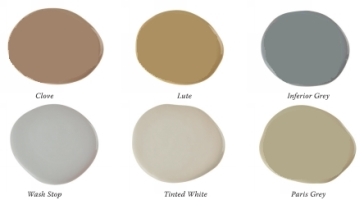
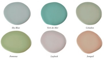
| George I and II colours: known as ‘common colours’, historic paint specialists still make them today. The names used here are taken from old colourman’s catalogues. | George III colours: a greater variety of colours became affordable in the second half of the 18th century as illustrated by these examples, again given names from the period. |
By the end of the century advances in manufacturing, the processing of paint ingredients and an increase in affluence had liberated the choice and use of colour in interiors. Fashion could play a greater part but social status remained a key determinant. By George IV’s regency the house painter was once again called upon to simulate costly natural materials like marble or bronze as well as to render a wide range of colour. Contemporary colourman’s catalogues give an insight into the cost and prevalence of colours and their suitability for use in oil or distemper.
We have inherited a vast and varied range of buildings from the Georgian period, from great country houses to humble cottages. In decorating many of them we are now concerned with their historical significance (often they are listed) and what is appropriate within the confines of modern taste, budget and practicality. The first thing to remember is that historic buildings are an information resource which helps to unlock our understanding of the past. We will not be able to read all of it and so it is important to allow future generations the widest possible access by preserving paint history and retaining period detail. Reversibility should underpin the design of alterations and avoidance of waste should determine what is retained. The redecoration of a historic interior has to start with these details – their restoration or reinstatement – the architecture can be our guide as to what is the appropriate period of a building’s evolution to return to modern use. When it comes to introducing colour we need to be aware of the sweep of history, but to start from the basics.
Colour is rendered in an interior by three principal means: the use of construction materials in their natural state, dyed yarn or cloth, and pigmented paints. This is as true today as it was in the reigns of the four Georges. Unlike today, however, the only materials available in the 18th century had to be derived from minerals, plants or animals. Their availability determined their use. Scarce pigments and rare dyes soon became associated with the wealthiest, most powerful and most sacred. Tropical hardwoods and imported marbles were the preserve of the rich. At the other end of the spectrum, earth pigments and native materials gave rise to the common colours.
It is not possible to disassociate the status of the owner with the appearance of interior decoration during this period. A poor household could only opt for a limited palette rendered with inexpensive paint binders, while the affluent owner could choose to construct his rooms with oak or exotic veneers, cut stone or statuary marble, flock papers or imported silks and their painters could employ the costliest pigments suspended in linseed oil.
 |
|
| The Hall at Purbrook, Hampshire, designed by Sir Robert Taylor. This watercolour, painted by Thomas Malton in the 1790s, shows the continued use of stone colour for halls well into George III’s reign. |
It is important to remember that dramatic advances in academic research and paint analysis have been made in recent years. At the same time the price differential between construction materials has narrowed and, in the case of paints, mainstream manufacturers now offer thousands of colours at price parity. The visual record of the Georgian period should also be treated with care. Portraits and room views are a vital source, but of course they tend to show affluent or even imaginary interiors. Similarly, coloured proposals made by the comparatively new profession of architect in this period are also to be treated as just ‘proposals’ unless paint analysis can prove the schemes were executed.
PAINT INVESTIGATIONS
Among the most important contributors to modern research in this field are John Cornforth, Ian Bristow and Patrick Baty, who have all greatly added to the body of knowledge about how colour was made and deployed in historic interiors. Their written works are invaluable and should be consulted by anyone keen to develop a good understanding of interior colour, particularly paints.
Paint analysis in John Cornforth’s day (the mid to late 20th century) was a matter for a scientific laboratory and he (with John Fowler) tended to rely on paint scrapes. As a result their findings cannot be seen to be that reliable. They did, however, interest themselves in the practicalities of the painters’ and upholsterers’ trades and their resulting insights were a useful step in a direction that has been superseded by what is thought of as a more scientific approach these days.
Paint analysis now conforms to an industry ‘best practice’ and involves high magnification observation and chemical testing. It can reveal the chronology of surviving paint layers fairly reliably, it can assess colour and it can identify pigments and binders. Typically, a modern equivalent is then provided for the colour match required – usually the ‘original’ scheme. This will be a specially prepared sample or an industry equivalent matched using a colour chart such as the NCS (Natural Colour System). The assumption is that this colour will be mixed in a modern paint which, since the 2010 VOC regulations, has essentially meant a plastic emulsion or eggshell (based on an acrylic or alkyd binder). In other words, we learn a great deal about the paint layers but in the cases where a historic recreation is required, we usually ignore what we have learnt about the binder, the solvent and even the origin of the pigment, in order to recreate the colour using commercial dyes and petro-chemical binders.
RESTORATION – THE IMPORTANCE OF THE MEDIA
For those seeking to restore a period property authentically this is important. Many decisions arise, all of which have cost implications and all of which affect the appearance of our work as well as the architectural and historic significance of the surviving fabric. Choices may include the use of timber or MDF, stone or cast dressings, marble or resin, vinyl or leather, joiner-made window or manufactured UPVC. In most cases the correct choice will be obvious since the vast majority of decisions are made from the standpoint that the ‘real thing’ will be used wherever possible. However, in 30 years I have seldom been asked to engage in this debate when it comes to paint. Plastic is fine as long as the colour is right!
Paint is a building product, it is there to protect and to decorate. Period buildings tend to have dynamic substrates that require breathability to prevent moisture becoming trapped, leading to decay. The character of a period building relies on the detailing of the components that make up the rooms: their line, their execution and their surface texture. The paint film strongly influences the amount of light reflected from surfaces and hence their appearance.
 |
|
| The Hall at Carlton House after redecoration in 1804: the columns were in scagliola but the rest of the decoration was painted in imitation of bronze, Sienna and Verde Antique offset by a granite green on the walls. |
Traditional paints were made with ground pigment in a medium based on lime or chalk (with a binder such as casein or size), or linseed oil and lead carbonate. Most modern paints are universally made with the same crude oil derived binder and are tinted with colorants. The appearance rendered is different and the way they behave in light is very different. More importantly, their porosity is vastly different and they cannot equal the breathability of traditional coatings.
Logically, the type of finish and the choice of medium is even more important than the choice of colour. Is cloth or wallpaper right, or should it be a paint colour applied directly to the substrate? And if so how should that paint be made? To follow historic precedent the probability is that rooms in all but the most important Georgian houses would have been painted with earth pigments in a white base. This gives an aesthetic that works well in a period and modern way, but we are also lucky enough to have a great range of other cost-effective wall coverings and colours and so we tend not to restrict ourselves to the common colours for these (typically Grade II listed) buildings.
The right approach in every case is to pay attention to tonality rather than colour because this will ensure that you choose from the right palette. To arrive at the right tonality for historic interiors is easily achieved if you start with the right range of pigments. Artists and house painters have shared a palette for centuries and I offer my selection to act as a summation to this brief exploration of colour:
- earth pigments: yellow ochre, raw umber and red ochre
- mineral pigments: chrome yellow, Prussian blue, ultramarine, viridian, black and white
- organic pigments: alizarin and carmine.
~~~
Further Information
P Baty, ‘The Hierarchy of Colour in Eighteenth Century Decoration’, 2011
IC Bristow, Architectural Colour in British Interiors 1615-1840, Yale University Press, New Haven and London, 1996
IC Bristow, Interior House-Painting Colours and Technology 1615-1840, Yale University Press, New Haven and London, 1996
N Eastaugh et al, Pigment Compendium: A Dictionary and Optical Microscopy of Historical Pigments, Routledge, London, 2008
J Fowler and J Cornforth, English Decoration in the 18th Century, Barrie & Jenkins, London, 1983
C Saumarez Smith, Eighteenth-century Decoration: Design and the Domestic Interior in England, Weidenfeld and Nicolson, London, 1993