


 161 / 196

T W E N T Y T H I R D E D I T I O N
T H E B U I L D I N G C O N S E R VAT I O N D I R E C T O R Y 2 0 1 6
1 6 1
INTER IORS
5
dominance of classicism as the complicated
designs of rococo France or gothic England
became achievable without the need for wood
carvers or marble masons.
Possibly as a hangover from 17th-
century practice, it became customary to
employ colour and gilding to elevate cheaper
materials to a higher status in decorative
schemes. Varied colour starts to become
more prevalent, initially in the form of tints
that required less pigment for ceilings and
gradually in stronger tones for wall schemes.
By the reign of George III the scene was
set for the great neo-classical architects,
Chambers, Wyatt and Adam, to introduce
intricate and subtly contrasting areas of
colour into wall and ceiling decoration. By
publishing their views and their designs
the Adam brothers dominated the field
of decoration, then and for posterity. The
colouring of the interiors of ancient buildings
was evidently their starting point. Over time
they adapted the palette to suit the times they
lived in as well as the availability of pigments.
Pale greens and blues became their default
colours but it can be argued that, after stony
off-whites, these were the default colours for
the reigns of all four Georges.
By the end of the century advances in
manufacturing, the processing of paint
ingredients and an increase in affluence had
liberated the choice and use of colour in
interiors. Fashion could play a greater part
but social status remained a key determinant.
By George IV’s regency the house painter
was once again called upon to simulate costly
natural materials like marble or bronze as
well as to render a wide range of colour.
Contemporary colourman’s catalogues give an
insight into the cost and prevalence of colours
and their suitability for use in oil or distemper.
We have inherited a vast and varied range
of buildings from the Georgian period, from
great country houses to humble cottages.
In decorating many of them we are now
concerned with their historical significance
(often they are listed) and what is appropriate
within the confines of modern taste, budget
and practicality. The first thing to remember
is that historic buildings are an information
resource which helps to unlock our
understanding of the past. We will not be able
to read all of it and so it is important to allow
future generations the widest possible access
by preserving paint history and retaining
period detail. Reversibility should underpin
the design of alterations and avoidance of
waste should determine what is retained.
The redecoration of a historic interior has to
start with these details – their restoration or
reinstatement – the architecture can be our
guide as to what is the appropriate period of a
building’s evolution to return to modern use.
When it comes to introducing colour we need
to be aware of the sweep of history, but to start
from the basics.
Colour is rendered in an interior by three
principal means: the use of construction
materials in their natural state, dyed yarn
or cloth, and pigmented paints. This is as
true today as it was in the reigns of the four
Georges. Unlike today, however, the only
materials available in the 18th century had to
be derived from minerals, plants or animals.
Their availability determined their use.
Scarce pigments and rare dyes soon became
associated with the wealthiest, most powerful
and most sacred. Tropical hardwoods and
imported marbles were the preserve of the
rich. At the other end of the spectrum, earth
pigments and native materials gave rise to the
common colours.
It is not possible to disassociate the
status of the owner with the appearance of
interior decoration during this period. A poor
household could only opt for a limited palette
rendered with inexpensive paint binders, while
the affluent owner could choose to construct
his rooms with oak or exotic veneers, cut stone
or statuary marble, flock papers or imported
silks and their painters could employ the
costliest pigments suspended in linseed oil.
It is important to remember that dramatic
advances in academic research and paint
analysis have been made in recent years. At
the same time the price differential between
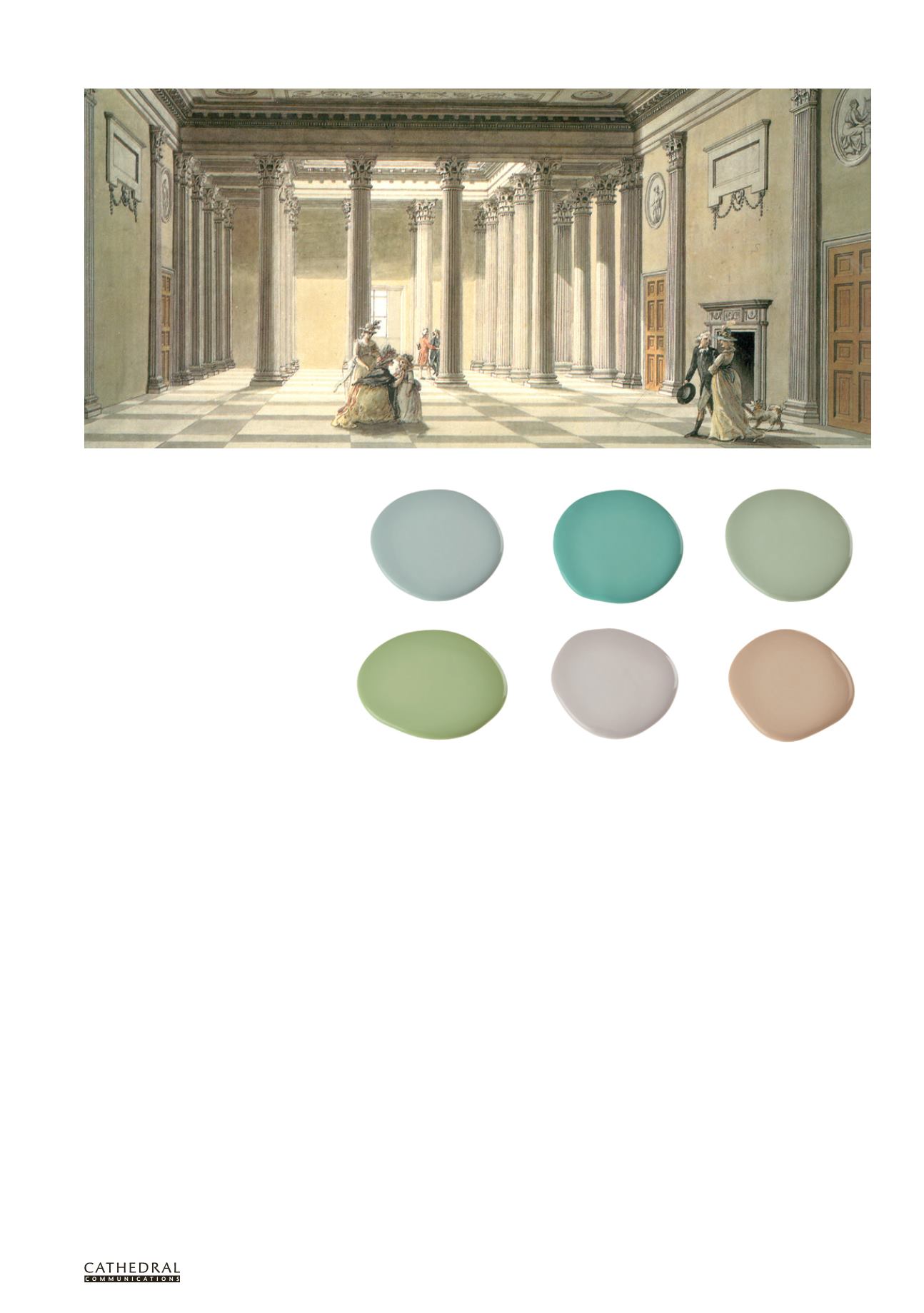
George III colours: a greater variety of colours became affordable in the second half of the 18th century as
illustrated by these examples, again given names from the period.
Sky Blue
Vert de Mer
Celadon
Pomona
Laylock
Jonquil
The Hall at Purbrook, Hampshire, designed by Sir Robert Taylor. This watercolour, painted by Thomas Malton in the 1790s, shows the continued use of stone colour for
halls well into George III’s reign.