


 160 / 196

1 6 0
T H E B U I L D I N G C O N S E R VAT I O N D I R E C T O R Y 2 0 1 6
T W E N T Y T H I R D E D I T I O N
INTER IORS
5
owner in its decorative arms and the other
ornamentation was frequently in the form of
relief and statuary. Paintings, when employed,
were often set into the walls as part of the
room’s architecture. Much the most common
decorative scheme for this room would have
been a stone white colour mixed with earth
pigments and perhaps carbon black. In terms
of democratising interior decoration this
proved to be the most influential room in the
house. Its colour scheme proclaimed gentility
and learning but its execution employed the
cheapest pigments. This could be emulated
right down the social scale. As a default this
approach endured throughout the Georgian
period. In many ways it endures to this day –
the communal spaces of high status buildings
are still often in a tinted white and the popular
predilection in selecting a colour is still to
choose a variant of white tinted with the
equivalent of earth pigments.
Early in the century fitting out of an
interior was generally done with full timber
panelling or just wainscot (a panelled dado
in effect). It was usual to use softwood if it
was to be painted and rooms that were to be
hung with paper or fabric would be battened
out above the wainscot and lined with canvas.
This meant that colour was mainly rendered
in oil paint allowing for deeper colouring
as, unlike the opaque white medium of a
limewash or distemper, linseed oil was clear,
meaning that the pigment went further.
Nevertheless it could take up to five coats to
achieve a solid colour and so lighter colours
remained the choice for economy.
Early in the Georgian period, strong
colour was usually introduced in dyed
cloth – damasks, wools and velvets. When
these fabrics were used for walling their
cost indicated a room of importance. This
could be a private or a public room but was
seen and used by a very select audience.
All the time the eye was to be delighted
but the mind was intended to understand
the status and cultured standing of the
patron. The dyes employed in Paris or Genoa
underlined this, blues, greens, reds and
yellows all signalled rarity and richness.
Following their use by the wealthy, the
producers of cheaper alternatives adopted
these colours for everything from flock paper
to wall paint. Luxury defined the palette
and was a function of cost. Colours became
emblematic as was the case in easel painting.
As the 18th century progressed, timber
wainscot gave way to plasterwork. While it
had been customary to paint panelling in
a uniform colour from skirting to cornice,
the arrival of applied wooden mouldings
on flat plastered walls allowed distempers
to be used on the flats. Using distemper
to decorate could allow for further cost
savings – minimal pigment was required to
produce an off-white oil paint for the trim,
and effective use of pigment with binders
meant greater coverage and therefore fewer
coats, for the walls. Picking-out required more
time but was a good way to emphasise the
skill of the ‘stuccadore’ and gradually plaster
ornamentation became the dominant vehicle
for styling a room. It spelled the end of the
George I and II colours: known as ‘common colours’, historic paint specialists still make them today. The names
used here are taken from old colourman’s catalogues.
Clove
Lute
Inferior Grey
Wash Stop
Tinted White
Paris Grey
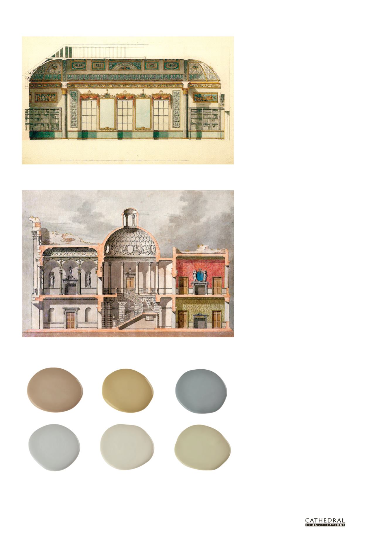
Robert Adam’s 1767 proposal for decorating the library at Kenwood House. Recent paint analysis has shown
that Adam’s proposal for gilding was not carried out until the second scheme and in the first scheme the
allocation of colour was changed.
Unexecuted design for York House, London by Sir William Chambers (1759): this and similar examples of
coloured cross sections clearly show the hierarchy of colour used in the Georgian period. Stone or common
colours are used in the communal spaces like the hall and stair and richer colours, some with pattern, adorn
the family rooms.